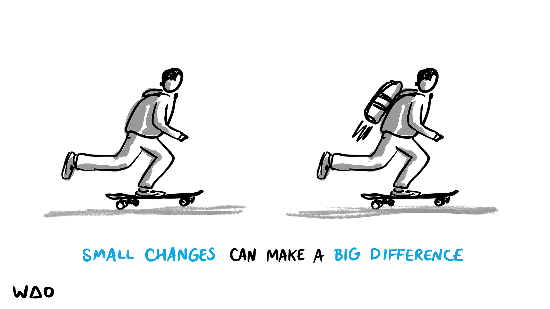
Buttons are the most common component in a design system, and they significantly contribute to its distinctiveness and uniqueness. There's a joke that we could call a frontend developer a "button developer," but the truth is that altering a button can transform the entire design system. Buttons play a crucial role in defining the visual and interactive aspects of an interface, making them a key element in creating a cohesive and engaging user experience.
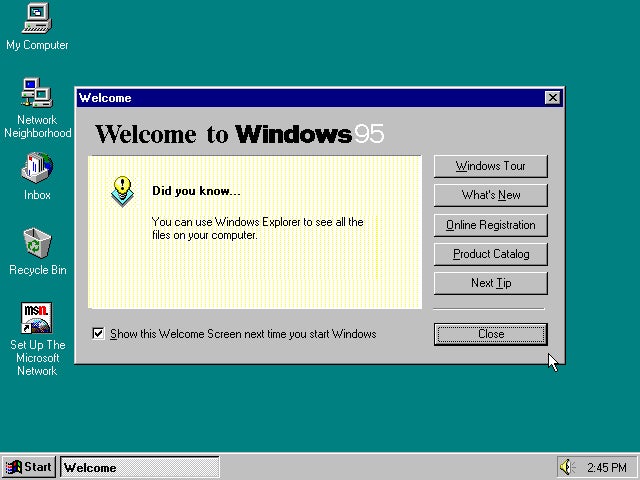
Nowadays, it's common to see web applications using flat buttons, making us forget how buttons looked in the early days when their user experience was often much better. Early button designs featured more depth and tactile feedback, which enhanced usability by providing clear visual cues and a more intuitive interaction. As we embrace modern flat design trends, it's important to remember and incorporate these effective UX principles to ensure buttons remain both functional and visually appealing.
Why we need a button looks like a button?
Despite trending designs, we must acknowledge that a button is primarily a functional component. As a designer, it is crucial to make buttons easy for users to quickly identify and interact with. Here are some best practices:
Size and color
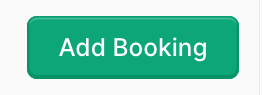
When placing call-to-action (CTA) buttons in a view, it is essential to make them stand out to attract user attention. These buttons should be larger than other components and have higher contrast compared to the surrounding context. The primary factors to consider are size and color, as these elements are most effective in drawing attention. People tend to notice large and brightly colored objects amidst less interactive content. Therefore, ensuring that your CTA buttons are both prominent in size and visually distinct in color will enhance their visibility and effectiveness.
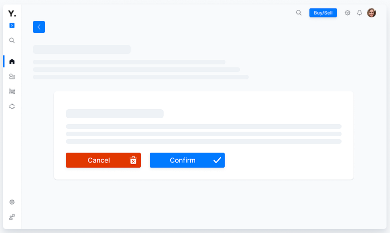
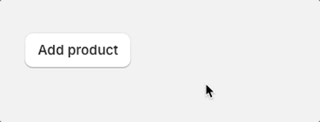
Box shadow
When there are many elements in a view, using box shadows can help distinguish them from their surrounding context, creating a 3D effect that makes them appear clickable. This technique leverages visual depth to highlight interactive elements. If you've seen the short film "Flatland," you'll recall that 3D shapes stand out distinctly among 2D shapes. Similarly, in a user interface, applying inset or outline box shadows to certain elements can create a sense of depth, making them more noticeable and intuitively interactive.
Animation enhancement
What do you feel when you press a button in real life? For me, I find the touch experience on some modern machines quite frustrating. The same applies to buttons in apps—if I don't get a clear tactile or visual response indicating that I've just pressed the button, it results in a really poor user experience.
Conclusion
Button is a vital element in creating a smooth user experience, so it’s worth paying attention to the best essential practices for them. By applying techniques such as adjusting size and color for prominence, using box shadows to create a 3D effect, and incorporating animations for feedback, you can ensure that your buttons are easily noticeable and interactive. These practices enhance the user's ability to intuitively interact with your app, providing a more satisfying and engaging experience.